|
|
| Line 4: |
Line 4: |
| | ''(Note: Please keep them coming! While some people have their favorites, I don't sense yet as consensus as regards a logo. We're looking to keep this contest open awhile, at least another month. We'd love to hear from as many people as possible before making a final decision. Thanks for all your submissions! -- [[User:FrJohn|Fr. John]], 13 Oct 2005)'' | | ''(Note: Please keep them coming! While some people have their favorites, I don't sense yet as consensus as regards a logo. We're looking to keep this contest open awhile, at least another month. We'd love to hear from as many people as possible before making a final decision. Thanks for all your submissions! -- [[User:FrJohn|Fr. John]], 13 Oct 2005)'' |
| | | | |
| − | ==Logos by [[User:HappyGrevling|HappyGrevling]]==
| |
| − | [[Image:GoldCrossWorldLogo.gif|Gold Cross World logo]]<br>
| |
| − | This submission is from [[User:HappyGrevling]]. He explains: "It has a stylized Orthodox cross in the background, with an image of the earth, representing universal, pan-Orthodox appeal. The logotype appears in an old looking scroll to give it an "ancient" feel."
| |
| | | | |
| − | ===Comments=== | + | ===Logos by [[User:HappyGrevling|HappyGrevling]]=== |
| − | * Looks nice! -[[User:FrJohn|Fr. John]]
| + | <gallery> |
| − | * Minor: The lower part of the globe is a bit [http://www.answers.com/dithered#Technology dithered]. Better reproduce this part of the logo in a smoother full-color rendition (use non-palletized PNG for background transparency rather than GIF).
| + | Image:GoldCrossWorldLogo.gif |
| − | * '''Go with this one''', although I'd give it a light Cyan bacground. The other three logos of my creation still have their uses. After the removal of the words "OrthodoxWiki", the first one would make a great church flag. The second has already been used as a wallpaper. The third one, if I can talk Fr. John into it, would be a part of a new section of digitized Church Scetches that would be nice to add to OrthodoxWiki. WebmasterConstantine
| + | Image:DomesLogo.gif |
| | + | Image:SealLogo1.gif |
| | + | Image:SealLogo2.gif |
| | + | </gallery> |
| | | | |
| | + | ===Logos by [[User:WebmasterConstantine]]=== |
| | + | <gallery> |
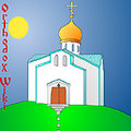
| | + | Image:Northstar.jpg |
| | + | Image:Owcrossstar.jpg |
| | + | Image:Churchsun.jpg |
| | + | </gallery> |
| | | | |
| − | [[Image:DomesLogo.gif|Domes logo]] | + | ===Logos from [[User:Raphael]]=== |
| | + | <gallery> |
| | + | Image:Wiki_Logo.jpg |
| | + | Image:Wiki_logo2.png |
| | + | </gallery> |
| | | | |
| − | I like this one a lot -- It looks classy. My only hesitation would be that it might be too "Russian"-specific. But you definitely have some good graphics skill. [[User:FrJohn|Fr. John]]
| + | ===Logos by Anonymous=== |
| | + | <gallery> |
| | + | Image:OWlogo.gif |
| | + | Image:OWlogo2.gif |
| | + | Image:Redcirclelogo.gif |
| | + | Image:OW_LogoSilver.gif |
| | + | </gallery> |
| | | | |
| | + | ===Submissions from [[User:ASDamick|Rdr. Andrew]]=== |
| | + | <gallery> |
| | + | Image:HagiaSophiaLogo-small.PNG |
| | + | Image:HagiaSophiaLogo2-small.PNG |
| | + | Image:ChurchesLogo-small.PNG |
| | + | Image:AltarLogo-small.PNG |
| | + | </gallery> |
| | | | |
| − | [[Image:SealLogo1.gif|Seal logo 1]]
| + | ===Submissions from a friend of [[User:Magda|Magda]]=== |
| − | [[Image:SealLogo2.gif|Seal logo 2]]
| + | <gallery> |
| − | | + | Image:DEOWlogo1.png |
| − | I kind of like this one. Looks very official and clean.
| + | Image:DEOWlogo2.png |
| − | | + | </gallery> |
| − | ==North Star Logo==
| |
| − | [[Image:Northstar.jpg|left|Webmaster Constantine's North Star logo]]
| |
| − | <br>This logo was submitted by [[User:WebmasterConstantine]] on Tuesday, Sept. 27th 2005. He writes: "It is a modified Alaskan Flag, a Midnight Blue field with a Golden Big Dipper. Replacing Polaris, the North Star, is the Blessing Cross. The Year 1794 is also displayed, all pointing to the fact that Orthodox Christianity first set foot in America in 1794 on Alaskan Soil, that Christ, symbolzed by the North Star, is whom we navigate by, and that American Orthodoxy points to Christ, as proclaimed by our early Alaskan Fathers."<br><br>
| |
| − | | |
| − | ===Comments:===
| |
| − | * My initial take is this: I appreciate the symbolism very much, and I like the stylized font for "OrthodoxWiki." I am concerned however, that, though the official language of this Wiki is English, it is not intended specifically as an American (or North American) project. We are grateful to have contributors from all over the world. I also have concerns about the visual effect of the strong blue background and the square-block design. One thing I like about it though is the way it integrates an OrthodoxWiki logo with a sense of mission and history/heritage/legacy/the saints. It's a very nice creative effort in this regard. - [[User:FrJohn|Fr. John]] 16:41, 27 Sep 2005 (EDT)
| |
| − | | |
| − | ==Two more from [[User:WebmasterConstantine]]==
| |
| − | {| align="center"
| |
| − | |[[Image:Owcrossstar.jpg|Rainbow Star Cross]]
| |
| − | | [[Image:Churchsun.jpg|Church Sun logo]]
| |
| − | |}
| |
| − | | |
| − | ===Comments===
| |
| − | A usability tip: It's always useful to test/optimize graphics for color blind vision. Use this free simulator: http://www.vischeck.com/vischeck/vischeckURL.php
| |
| − | Enter the URL of the current page with the logos(http://www2.orthodoxwiki.org/OrthodoxWiki:Logo_Submissions ), select a color vision type (try all three) and see if results are acceptable.
| |
| − | | |
| − | ==Iconic Book ==
| |
| − | | |
| − | [[Image:Wiki_Logo.jpg|left|Raphael's suggestion]] A logo suggestion from [[user:Raphael|Raphael]]. I used the idea of a book such as one might see in an icon. The light of knowledge and a larger sphere representing "the net".
| |
| − | | |
| − | <br><br><br><br><br><br><br><br><br><br><br><br><br>
| |
| − | ==One more from [[User:Raphael]]==
| |
| − | [[Image:Wiki_logo2.png|Raphael's suggestion 2]] Another logo suggestion from [[user:Raphael|Raphael]].
| |
| − | | |
| − | This one is now my first choice. It has a nice soothing blue background, and it gets the idea across. Put a period between Orthodox & Wiki, and it would be perfect.
| |
| − | | |
| − | WebmasterConstantine
| |
| − | | |
| − | <br>
| |
| − | | |
| − | * This is also a nice logo. My only concern is how it will look on any sort of textured or colored background (specifically the upper left corner of this page). It would be unfortunate to have to put it in a white box. I don't think it needs a period. --HappyGrevling
| |
| − | | |
| − | ==OOO WWW Logo==
| |
| − | I received this by email anonymously this morning -- not sure who would get the credit. - [[User:FrJohn|Fr. John]]
| |
| − | | |
| − | [[Image:OWlogo.gif]] [[Image:OWlogo2.gif]]
| |
| − | | |
| − | ===Comments===
| |
| − | I like the first "O" and the Cross being the "t", as well as the decreasing-sized wiki, but perhaps the other "o"s in "Orthodox" could just be regularly-sized for balance? [[User:Magda|{{User:Magda/sig}}]] 12:32, 1 Oct 2005 (EDT)
| |
| − | | |
| − | ::Looks like a second logo was submitted according to your suggestions, Magda. [[User:FrJohn|Fr. John]]
| |
| − | | |
| − | I consider this too much of a good thing. It's the type of thing I would do in my younger days. One O or T would be enough.<br>
| |
| − | - [[User:WebmasterConstantine|WebmasterConstantine]]
| |
| − | | |
| − | ==Circle Logos==
| |
| − | Two variations submitted by the same anonymous person as above.
| |
| − | | |
| − | [[Image:Redcirclelogo.gif]] [[Image:OW_LogoSilver.gif]]
| |
| − | | |
| − | | |
| − | Also acceptable. Subdued, but gets the idea across.
| |
| − | | |
| − | WebmasterConstantine
| |
| − | | |
| − | | |
| − | ==Submissions from [[User:ASDamick|Rdr. Andrew]]==
| |
| − | [[Image:HagiaSophiaLogo-small.PNG]] [[Image:HagiaSophiaLogo2-small.PNG]] [[Image:ChurchesLogo-small.PNG]] [[Image:AltarLogo-small.PNG]]
| |
| − | | |
| − | | |
| − | | |
| − | | |
| − | ==Submissions from a friend of [[User:Magda|Magda]]== | |
| − | I asked a friend of mine to try his hand at a logo for Orthodoxwiki, and here is his work:
| |
| − | | |
| − | [[Image:DEOWlogo1.png]]
| |
| − | | |
| − | | |
| − | | |
| − | [[Image:DEOWlogo2.png]]
| |
| − | | |
| − | ==Submissions from [[User:Guldfisken|Guldfisken]]==
| |
| − | Here's an idea I've had. The scroll is for "knowledge", and the current OrthodoxWiki symbol signifies Orthodoxy. <br>
| |
| − | There is a larger version available. I realise there's a problem with the top left edge of the scroll, but this is more of a draft, really.
| |
| − | | |
| − | | |
| − | [[Image:Logoidea-gfisken-small.png]]
| |
| − | | |
| | | | |
| | + | ===Submissions from [[User:Guldfisken|Guldfisken]]=== |
| | + | <gallery> |
| | + | Image:Logoidea-gfisken-small.png |
| | + | </gallery> |
| | | | |
| | [[Category:OrthodoxWiki]] | | [[Category:OrthodoxWiki]] |
